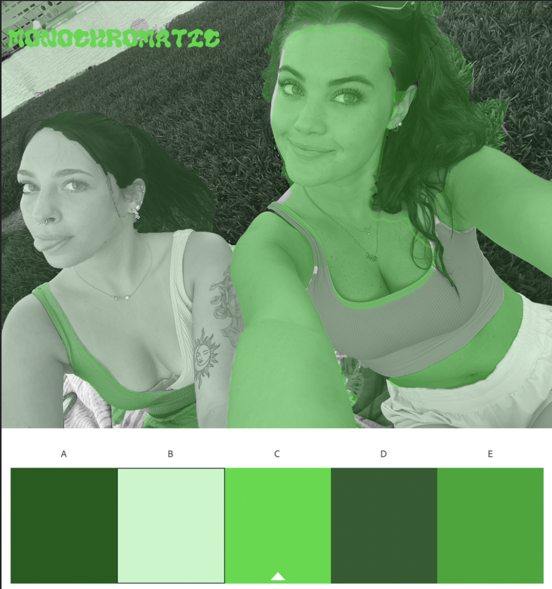
BW to COLOR - ADOBE PHOTOSHOP
For this assignment, I decided to base my color schemes off of the current seasons and holidays around us. I chose green monochrome for St. Patricks day, the pastel analogous for Easter, and the double split complementary for spring as a whole. My favorite thing about this time of year is all the bright colors and flowers that come along with it, so I really wanted that to reflect in my artwork.
For the shading, I decided to try a create a variation between giving Bella and I the same tones within images. For example, my shirt was one color then her shirt would have a different one (with the exception of skin tone in the analogous photo). I felt by doing this it made the image pop much more, giving your eyes a lot to look at instead of one large blob drawing in all of the attention.
I really enjoyed this project because I find the object selection tool very fun and easy to use, and getting to decide which colors worked best for me on the color wheel made it feel much more engaging as well!


Comments
Post a Comment