Business Card
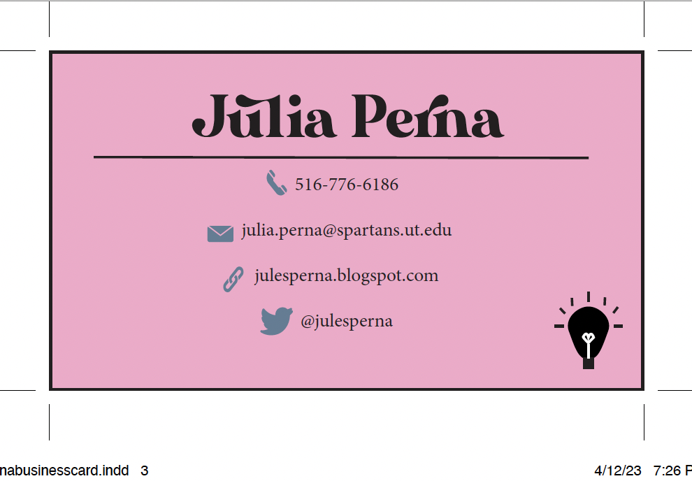
Artist Statement: For my business cards, I kept my same color scheme that I have been working with since the beginning of the semester. I took three different stylistic approaches, ranging from casual to more sophisticated. Displayed on this post from top to bottom, it goes from most casual, mid casual, and most business-oriented. I am very happy this is a project we had to focus on during the class because this is an important skill I'm going to need for my future career, and dedicating a lesson to it gave me a big head start on the learning process.


I really like the designs for all of these business cards. The colors, the lightbulb logo, the fonts all fit together so well. I really like the first one a lot, I don't know how you made that color gradient, but I really like it.
ReplyDeleteI really like how all of your business card designs are so different and demonstrate different aspects of your personality.
ReplyDelete