Posts

Final Portfolio

Image
For my blog post, I decided to keep the same color scheme that I have been using this entire year. If it is not clear by now, pink and green are my two favorite colors, and it has been great to be able to use them so much during class time. Having creative freedom on this portfolio was definitely my favorite part of the project because I was able to show my personality as well as my work in one form of media. Thanks for a great year everyone!

Tagbrush

Image
  For my tag brush, I decided to do a mix of pastels and neon colors to create a contrast and also allow your eyes to bounce around the page instead of focusing on one spot. I created this brush by taking my logo that I created in class and distorting it using scratches and paint splatter on Adobe Photoshop. I designed my logo this way to represent thinking about the bigger picture, and keeping your heart in mind while doing so.

Business Card

Image
Artist Statement: For my business cards, I kept my same color scheme that I have been working with since the beginning of the semester. I took three different stylistic approaches, ranging from casual to more sophisticated. Displayed on this post from top to bottom, it goes from most casual, mid casual, and most business-oriented. I am very happy this is a project we had to focus on during the class because this is an important skill I'm going to need for my future career, and dedicating a lesson to it gave me a big head start on the learning process.   

Postcard

Image
Artist Statement: For my postcard, I decided to stick with the theme I have used in most of my projects and use a very light and pastel color scheme. I used a stock image of Clearwater Beach from the end of August as my focal point, being that Tampa Bay is very famously known for their sunsets. The sunsets in our area are one of the main tourist attractions, with multiple places in Clearwater hosting "sunset parties" and other events to commemorate that time of the day. Because of this, I felt that scenery would be the most effective on a postcard, whether for sending it to show off your location or receiving it and sparking curiosity about the destination.

Animation Project

Image
Still Image Gif Artist Statement: With the weather in Tampa getting warmer, Easter being this weekend, and spring/summer approaching, I decided to make my animation project using a flower. I used bright and pastel colors to capture the happiness of this time of year as well as follow the color scheme of the upcoming holidays. I am very happy with the way this project turned out and definitely feel as if animation has been my favorite thing to learn in this class so far!  

InDesign Tutorials

  Video 1: How to make BEAUTIFUL and EASY InDesign Layouts. Episode 3 https://www.youtube.com/watch?v=bDBYGX1FXww Video 2: Adobe InDesign Tutorial: Placing, Formatting & Fitting Images in Adobe InDesign https://www.youtube.com/watch?v=WYWXIf7oO10 Video 3: HOW TO MAKE 3D SUSHI IN SECONDS IN ADOBE ILLUSTRATOR https://www.youtube.com/watch?v=EvnaJDvgEmM 

Somewhere Project

Image
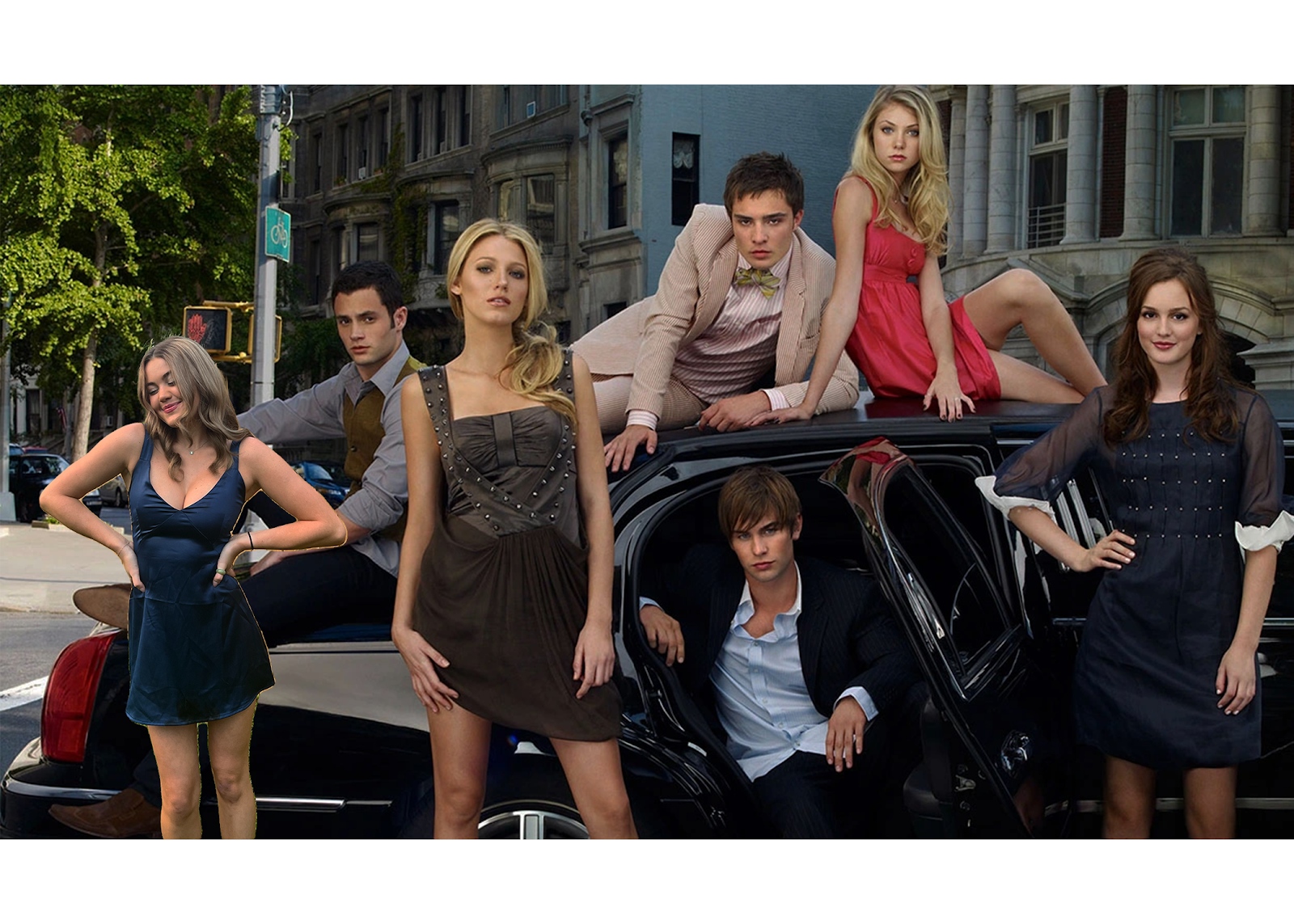
For my "somewhere" project I decided to insert myself into my favorite show of about 10 years now, Gossip Girl. Before coming to Tampa for college I lived in New York, where the show takes place, so it was always nice to watch and be able to recognize most of the places they filmed at. The show focuses on the "elite socialites" in Manhattan in the early 2000's, so I've also always enjoyed watching the luxury and glamor the characters got to portray with their roles. I chose to insert myself against the car due to the symmetry of the picture, noting that the typical pattern of how they were arranged is boy, girl, and so on. Also, Blaire Waldorf (the brunette) is on the opposite side of the limo which allowed where I placed myself to even out the focal point of the image, instead of drawing all of the attention to one side. Lastly, I chose to use a navy dress because the overall color scheme of the image is on the darker side, with the exception of Jenny Humph