Posts

Photoshop Homework 3

Image
I found this image to be the one I would struggle photoshopping myself into the most. This image gave me inspiration for my "somewhere" project This was the funniest photoshop image on the webpage, in my opinion. This illusion is one that I would want to recreate at some point.

BW to COLOR - ADOBE PHOTOSHOP

Image
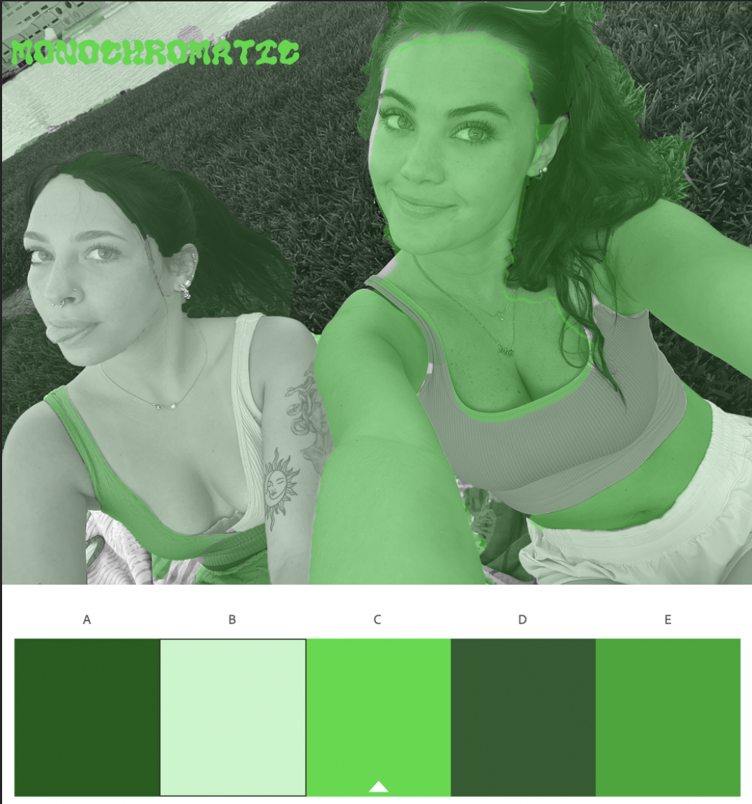
For this assignment, I decided to base my color schemes off of the current seasons and holidays around us. I chose green monochrome for St. Patricks day, the pastel analogous for Easter, and the double split complementary for spring as a whole. My favorite thing about this time of year is all the bright colors and flowers that come along with it, so I really wanted that to reflect in my artwork. For the shading, I decided to try a create a variation between giving Bella and I the same tones within images. For example, my shirt was one color then her shirt would have a different one (with the exception of skin tone in the analogous photo). I felt by doing this it made the image pop much more, giving your eyes a lot to look at instead of one large blob drawing in all of the attention. I really enjoyed this project because I find the object selection tool very fun and easy to use, and getting to decide which colors worked best for me on the color wheel made it feel much more engaging as w...

Photoshop Homework 2

Image
March 12th, 2023 Out of all the images featured within the documentary, I definitely think that this one spoke to me the most. I am very mesmerized by the way the artist was able to make it look like he is truly drowning in the can of tomato soup while also using it as a metaphor for the cover of the magazine. I also appreciate the amount of detail that was put into the cover while also remaining so realistic looking. The image did not necessarily "trigger" any emotions in me, but it was definitely the one I was most receptive to because of how creative the idea is and  For my image, my friend Bella and I decided to sit in Plant Park and watch the sunset the other night. We try to keep this tradition at least once a week, just as a way to relax and de stress from our classes and everything else going on in the world around us. Watching the sunset is one of my favorite things to do in the whole world, especially at the beach or by the river, and Bella is one of my best friends...

Photoshop Tutorials & Explanations

 https://www.youtube.com/watch?v=PrxTg0RtGpA Easy Y2K Halftone Texture / Photoshop Tutorial 2022 https://www.youtube.com/watch?v=IE5CDh9lOos Glow Effect - Photoshop Tutorial /Glowing Effect in Photoshop (easy) https://www.youtube.com/watch?v=-CIFGBcbPPg Poster Design in Photoshop / Modeling Poster design step by step Tutorial

Propaganda Poster

Image
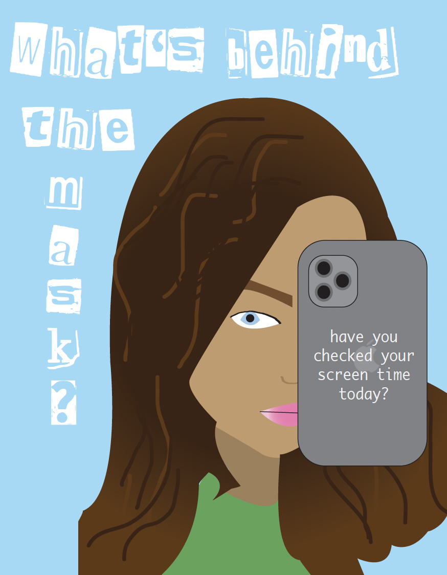
  For my poster I decided to focus on one of the main problems that the current and future generations deal with on a daily basis: the overuse of screen time. While the creation of cellphones has been great for communication purposes, the developments that took place inside the phones (social media, more specifically) have allowed people to mask their identity and be someone they're not online. It leads to more bullying, more harassment, and way less internet safety than we have ever seen before... which all stems from how long you are allowing yourself to spend on your phone in a given day. I intended for my poster to serve as a reminder for people of all ages that the way you portray yourself online is not who you truly are (at least in most cases, if it is then good for you!), and your screen time number is a reflection on how much time you spend daily living in the fantasy world that you created by using your technology. Some apps are necessary, some are innovative, and some ar...

Logo Project

Image
  With this assignment taking place around valentines day, I decided to focus my logo around love and light. The overall logo is a lightbulb, but the twist is that instead of a normal lighting fixture inside I chose to do a heart instead. The first one is a basic representation of "love and light" using a light pink as the main color with white accents to show happiness. The second one, using different types of blues, kind of paints the idea in a sad to happy light, with the base of the lightbulb going from dark to light blue and the core lightbulb being dark blue with a white light shining on the heart. The transition from dark to light colors is supposed to represent the happy to sad pipeline, or healing from past wounds in a way. The third and final logo uses lime and kelly green, and this one is supposed to be a representation of love for the planet. With spring coming up and being able to spend more time outside, I figured that it would be important to shed "light...

Paula Scher Documentary Assignment

Image
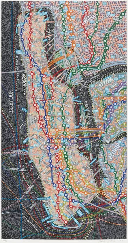
     For me, being in the "state of play" means living in the moment, or watching a moment/memory unfold right in front of your eyes. To be in a state of play I feel as if you have to be completely locked in on what you are doing, just like how you are while playing in a sports game or another important activity. While in a state of play I also feel as if your brain is able to think more logistically and creatively, which in turn will assist you in coming up with the best ideas and possible outcomes possible.     I think that I am able to come up with my best ideas while sitting outside along the riverwalk on our campus, sitting at armature works, and while walking on Bayshore Blvd. Being outside, in my opinion, is the most mind freeing thing you can possibly do for yourself and is a great way to clear your head and start fresh. Whenever I am struggling creatively or have an important assignment to do I either sit along the river and work or go on a walk beforeh...