Posts

Final Portfolio

Image
For my blog post, I decided to keep the same color scheme that I have been using this entire year. If it is not clear by now, pink and green are my two favorite colors, and it has been great to be able to use them so much during class time. Having creative freedom on this portfolio was definitely my favorite part of the project because I was able to show my personality as well as my work in one form of media. Thanks for a great year everyone!

Tagbrush

Image
  For my tag brush, I decided to do a mix of pastels and neon colors to create a contrast and also allow your eyes to bounce around the page instead of focusing on one spot. I created this brush by taking my logo that I created in class and distorting it using scratches and paint splatter on Adobe Photoshop. I designed my logo this way to represent thinking about the bigger picture, and keeping your heart in mind while doing so.

Business Card

Image
Artist Statement: For my business cards, I kept my same color scheme that I have been working with since the beginning of the semester. I took three different stylistic approaches, ranging from casual to more sophisticated. Displayed on this post from top to bottom, it goes from most casual, mid casual, and most business-oriented. I am very happy this is a project we had to focus on during the class because this is an important skill I'm going to need for my future career, and dedicating a lesson to it gave me a big head start on the learning process.   

Postcard

Image
Artist Statement: For my postcard, I decided to stick with the theme I have used in most of my projects and use a very light and pastel color scheme. I used a stock image of Clearwater Beach from the end of August as my focal point, being that Tampa Bay is very famously known for their sunsets. The sunsets in our area are one of the main tourist attractions, with multiple places in Clearwater hosting "sunset parties" and other events to commemorate that time of the day. Because of this, I felt that scenery would be the most effective on a postcard, whether for sending it to show off your location or receiving it and sparking curiosity about the destination.

Animation Project

Image
Still Image Gif Artist Statement: With the weather in Tampa getting warmer, Easter being this weekend, and spring/summer approaching, I decided to make my animation project using a flower. I used bright and pastel colors to capture the happiness of this time of year as well as follow the color scheme of the upcoming holidays. I am very happy with the way this project turned out and definitely feel as if animation has been my favorite thing to learn in this class so far!  

InDesign Tutorials

  Video 1: How to make BEAUTIFUL and EASY InDesign Layouts. Episode 3 https://www.youtube.com/watch?v=bDBYGX1FXww Video 2: Adobe InDesign Tutorial: Placing, Formatting & Fitting Images in Adobe InDesign https://www.youtube.com/watch?v=WYWXIf7oO10 Video 3: HOW TO MAKE 3D SUSHI IN SECONDS IN ADOBE ILLUSTRATOR https://www.youtube.com/watch?v=EvnaJDvgEmM 

Somewhere Project

Image
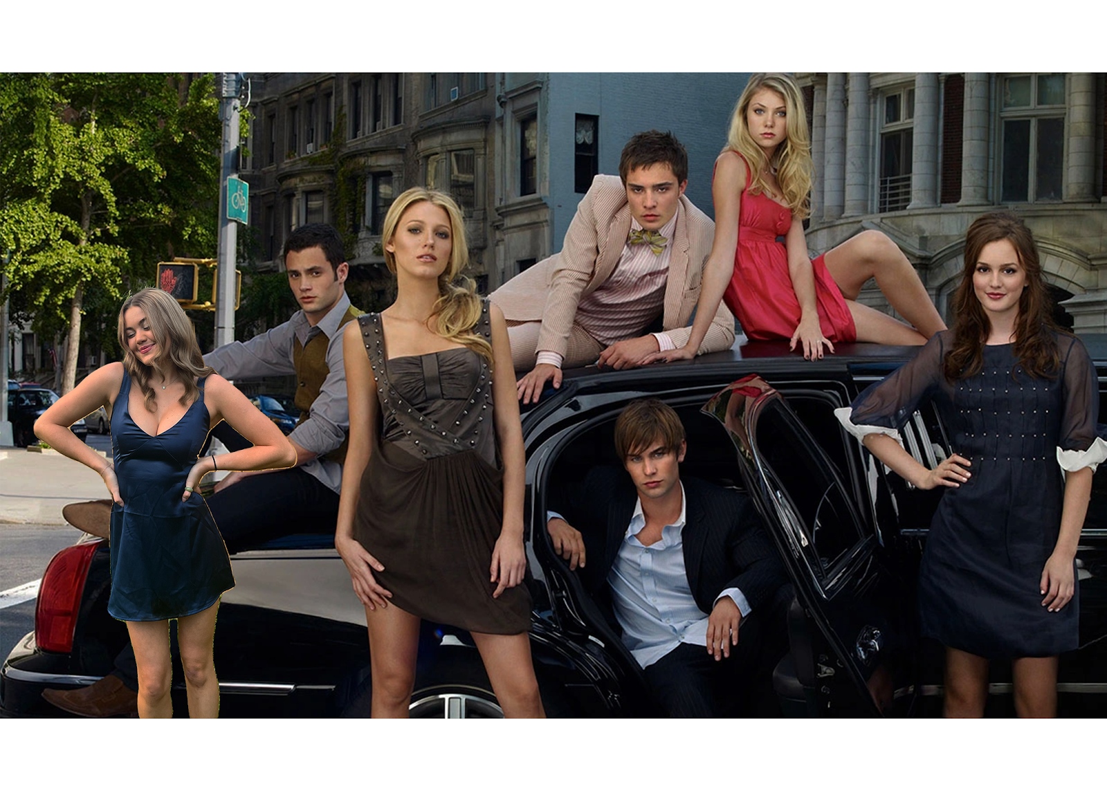
For my "somewhere" project I decided to insert myself into my favorite show of about 10 years now, Gossip Girl. Before coming to Tampa for college I lived in New York, where the show takes place, so it was always nice to watch and be able to recognize most of the places they filmed at. The show focuses on the "elite socialites" in Manhattan in the early 2000's, so I've also always enjoyed watching the luxury and glamor the characters got to portray with their roles. I chose to insert myself against the car due to the symmetry of the picture, noting that the typical pattern of how they were arranged is boy, girl, and so on. Also, Blaire Waldorf (the brunette) is on the opposite side of the limo which allowed where I placed myself to even out the focal point of the image, instead of drawing all of the attention to one side. Lastly, I chose to use a navy dress because the overall color scheme of the image is on the darker side, with the exception of Jenny Humph...

Photoshop Homework 3

Image
I found this image to be the one I would struggle photoshopping myself into the most. This image gave me inspiration for my "somewhere" project This was the funniest photoshop image on the webpage, in my opinion. This illusion is one that I would want to recreate at some point.

BW to COLOR - ADOBE PHOTOSHOP

Image
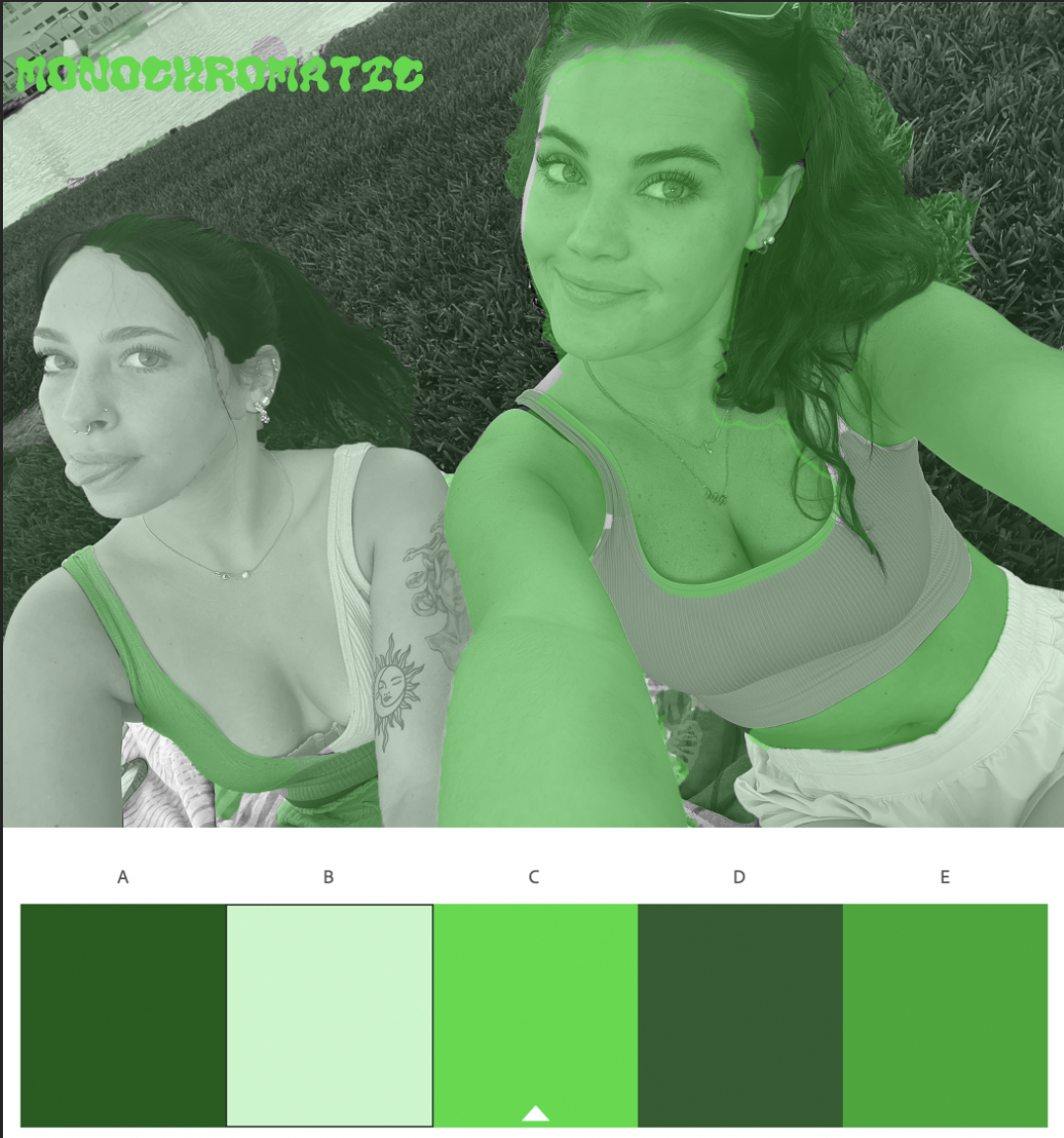
For this assignment, I decided to base my color schemes off of the current seasons and holidays around us. I chose green monochrome for St. Patricks day, the pastel analogous for Easter, and the double split complementary for spring as a whole. My favorite thing about this time of year is all the bright colors and flowers that come along with it, so I really wanted that to reflect in my artwork. For the shading, I decided to try a create a variation between giving Bella and I the same tones within images. For example, my shirt was one color then her shirt would have a different one (with the exception of skin tone in the analogous photo). I felt by doing this it made the image pop much more, giving your eyes a lot to look at instead of one large blob drawing in all of the attention. I really enjoyed this project because I find the object selection tool very fun and easy to use, and getting to decide which colors worked best for me on the color wheel made it feel much more engaging as w...

Photoshop Homework 2

Image
March 12th, 2023 Out of all the images featured within the documentary, I definitely think that this one spoke to me the most. I am very mesmerized by the way the artist was able to make it look like he is truly drowning in the can of tomato soup while also using it as a metaphor for the cover of the magazine. I also appreciate the amount of detail that was put into the cover while also remaining so realistic looking. The image did not necessarily "trigger" any emotions in me, but it was definitely the one I was most receptive to because of how creative the idea is and  For my image, my friend Bella and I decided to sit in Plant Park and watch the sunset the other night. We try to keep this tradition at least once a week, just as a way to relax and de stress from our classes and everything else going on in the world around us. Watching the sunset is one of my favorite things to do in the whole world, especially at the beach or by the river, and Bella is one of my best friends...

Photoshop Tutorials & Explanations

 https://www.youtube.com/watch?v=PrxTg0RtGpA Easy Y2K Halftone Texture / Photoshop Tutorial 2022 https://www.youtube.com/watch?v=IE5CDh9lOos Glow Effect - Photoshop Tutorial /Glowing Effect in Photoshop (easy) https://www.youtube.com/watch?v=-CIFGBcbPPg Poster Design in Photoshop / Modeling Poster design step by step Tutorial

Propaganda Poster

Image
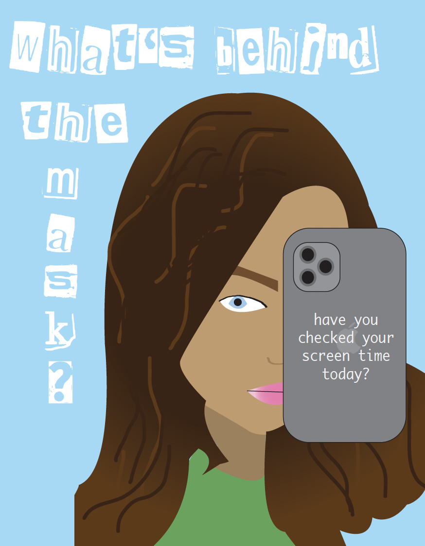
  For my poster I decided to focus on one of the main problems that the current and future generations deal with on a daily basis: the overuse of screen time. While the creation of cellphones has been great for communication purposes, the developments that took place inside the phones (social media, more specifically) have allowed people to mask their identity and be someone they're not online. It leads to more bullying, more harassment, and way less internet safety than we have ever seen before... which all stems from how long you are allowing yourself to spend on your phone in a given day. I intended for my poster to serve as a reminder for people of all ages that the way you portray yourself online is not who you truly are (at least in most cases, if it is then good for you!), and your screen time number is a reflection on how much time you spend daily living in the fantasy world that you created by using your technology. Some apps are necessary, some are innovative, and some ar...

Logo Project

Image
  With this assignment taking place around valentines day, I decided to focus my logo around love and light. The overall logo is a lightbulb, but the twist is that instead of a normal lighting fixture inside I chose to do a heart instead. The first one is a basic representation of "love and light" using a light pink as the main color with white accents to show happiness. The second one, using different types of blues, kind of paints the idea in a sad to happy light, with the base of the lightbulb going from dark to light blue and the core lightbulb being dark blue with a white light shining on the heart. The transition from dark to light colors is supposed to represent the happy to sad pipeline, or healing from past wounds in a way. The third and final logo uses lime and kelly green, and this one is supposed to be a representation of love for the planet. With spring coming up and being able to spend more time outside, I figured that it would be important to shed "light...

Paula Scher Documentary Assignment

Image
     For me, being in the "state of play" means living in the moment, or watching a moment/memory unfold right in front of your eyes. To be in a state of play I feel as if you have to be completely locked in on what you are doing, just like how you are while playing in a sports game or another important activity. While in a state of play I also feel as if your brain is able to think more logistically and creatively, which in turn will assist you in coming up with the best ideas and possible outcomes possible.     I think that I am able to come up with my best ideas while sitting outside along the riverwalk on our campus, sitting at armature works, and while walking on Bayshore Blvd. Being outside, in my opinion, is the most mind freeing thing you can possibly do for yourself and is a great way to clear your head and start fresh. Whenever I am struggling creatively or have an important assignment to do I either sit along the river and work or go on a walk beforeh...

Calligram Project

Image
  February 6 th , 2023 For my calligram project, I found it most fitting to put my “letter to my future self” in the letter J, because over the next 20 years the only think I know for certain that won’t change about me is my first name. My first idea was to do a house, but while I was playing around with illustrator in class, I later decided that the “J” with a heart over it would be the best option. This project as a whole took me about three hours to complete, between getting the text to line up perfectly, be all the same size, and doing a few rough drafts of my sketch. January 30, 2023   Dear Future Me,               Currently you are sitting at your college job at Obsessed Boutique writing this letter for your COM225 class, Digital Media. It’s your second semester of junior year, two days after gasparilla, and you’ve actually done a good job of balancing the school & social barrier this semester (besides ...

Illustrator Tutorials and Explanations

  Julia Perna January 25 th , 2023   Illustrator Tutorials and Explanations   https://www.youtube.com/watch?v=IBouhf4seWQ The Complete Beginners Guide to Adobe Illustrator l FREE COURSE      This video starts out with a brief explanation on what Adobe Illustrator is, mentioning that it is the best tool in the Creative Suite for making logos, illustrations, posters, infographics, t-shirt designs, and flyers. It is also mentioned that the tools in illustrator make it very easy to create and modify shapes and strokes to build your compositions, which puts me at some sort of ease being new to this program.     The project he first focuses on during the video is turning a hand drawn sketch that was scanned into illustrator and converted to vector artwork, and turning into a poster/t-shirt design to demonstrate a scenario where we are going to design for print. He then begins to show how we incorporate CMYK swatches and pantones into the artwork, which ...

Internet / World Wide Web / Bluetooth / Wi-Fi

  Julia Perna January 25 th , 2023   Internet / World Wide Web / Bluetooth / Wi-Fi   Today’s world as we know it would not be able to function without the creation of the internet, but do any of us really know how it came to be? If it was to suddenly disappear one day businesses would not be able to function, schoolwork wouldn’t be able to be completed, social interactions would be much more limited. It is something we all utilize so much without realizing, whether it’s used happily or not, yet since it has always been there for most of us we have never even batted an eye towards the topic of its creation. The world is powered by the internet and everything that has come with it, such as the World Wide Web, Wi-Fi and Bluetooth, and now it is time to find out how it became so important.               The textbook definition of the internet, sometimes referred to as “the net”, is a worldwide system of computer...
Image
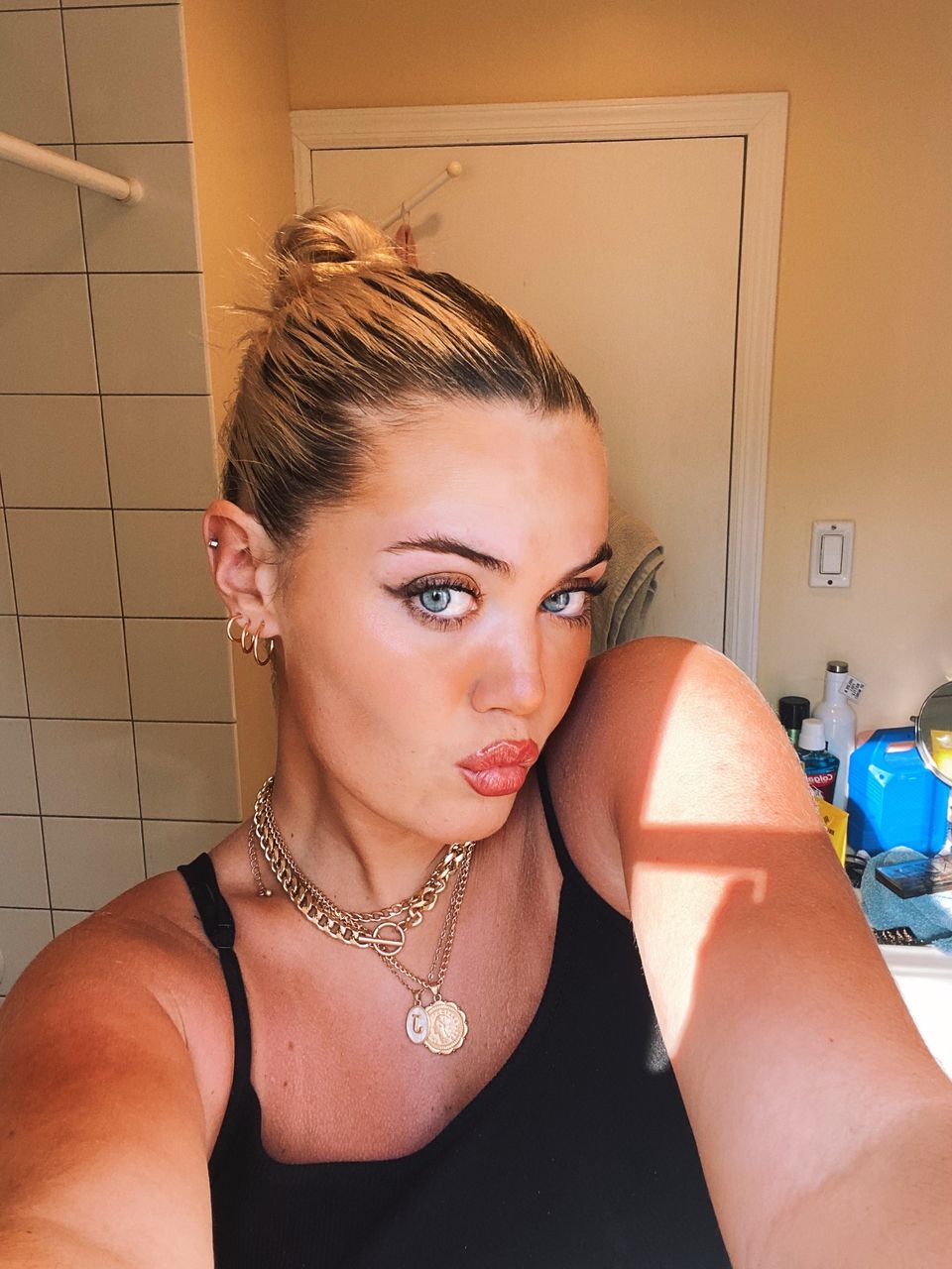
       My name is Julia Perna and I am currently in the second semester of my Junior year at the University of Tampa. I am a AD/PR major with a concentration in PR, but I spent my first year and a half here as a business management major. I'm originally from New York, and I lived there my entire life until I decided to come down to Tampa for school. Outside of my school and work life I love going to the beach, spending time with friends, walking the river walk, and just sitting in Plant Park on campus.       I'm very excited to take this class because as a PR major it is very important for me to develop skills revolving around the Adobe cloud, which I have been trying to learn on my own for about a year now. I'm really looking forward to all the different projects we do, because creating different types of art has always been one of my passions and seeing a project come together will always be so interesting to me. From the first class, it was mad...